CASE STUDY / REZENKIA LEE / WELLNESS IDENTITY
Rooted in nature.
Made to feel like her.
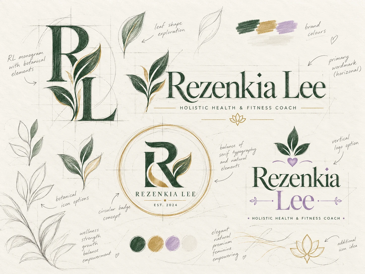
A botanical identity exploration.
A connected family of marks.
Natural character.
Considered form.
A primary wordmark sets the tone. Botanical details and serif letterforms give the identity its character. A monogram and circular badge carry the same idea into smaller spaces.
The study explores how evergreen, warm ivory, gold, and a note of lavender can connect a name with a whole visual world.
Proposal identity study.
THE PALETTE
A grounded world.
A softer note.
YOUR BRAND HAS A CHARACTER, TOO